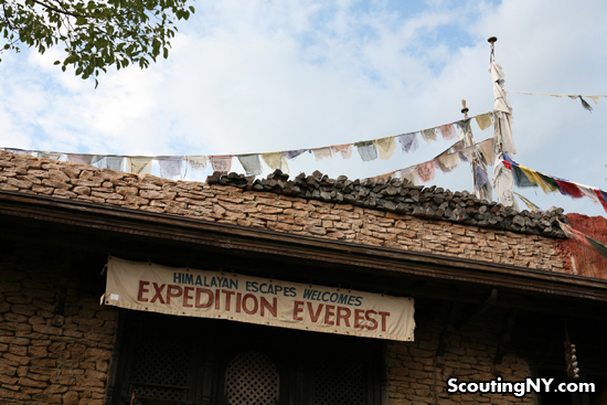
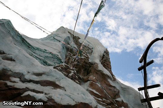
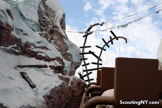
On Saturday, after a 29 hour flight, my girlfriend and I landed in Tibet for our long-awaited vacation. And despite how exhausted we were, seeing the peaks of Everest through lines of tattered prayer flags was, without question, one of the most amazing moments in my life.
Er, so maybe we weren’t exactly in Tibet…
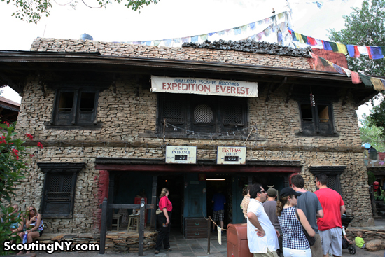
As some of you may have recognized, these pictures were actually taken in not-so-snowy Florida, at Disney World’s Animal Kingdom (specifically the “Expedition Everest” ride, one of my favorites which I’ll get back to in a bit).
We decided to start our road trip to Key West in Orlando because my girlfriend’s sister lives there, and there’s no better way to start a road trip than on a free bed.
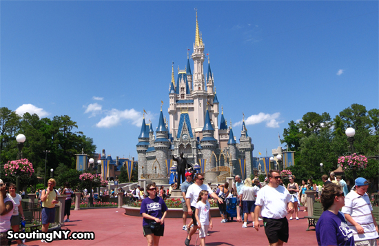
And of course, being in Orlando, we had to spend a day at Disney World.
I never got to go to Disney World as a kid, and when I finally went for the first time a few years ago, I was sure I was going to hate it. The lines, the crowds, the kiddie rides, the saccharine artificiality of it all…
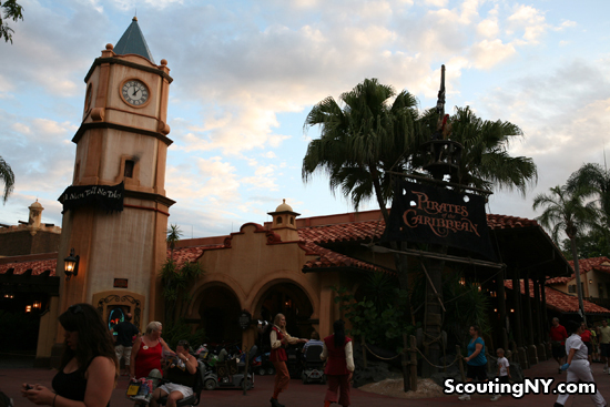
And of course, I fell in love with the whole damn thing from my first ride on Pirates of the Caribbean.
Above all, I remember being blown away by how perfectly and completely realized the park was. This wasn’t just the sort of haphazard design you find at, say, a Six Flags, where a half-hearted theme is attached to thrill rides aimed at kids with short attention spans. In fact, half the fun was just experiencing the wonderfully imaginative world outside the actual rides.
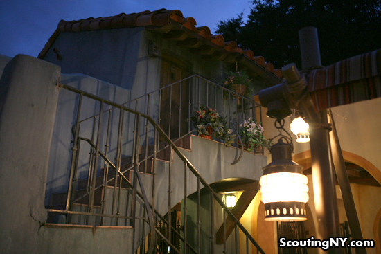
Little nooks like this upstairs apartment nearby to Pirates, complete with balcony flowers, is the sort of minor detail that makes Disney World so special. Who lives here? No one of course, but tell me this doesn’t fire your imagination to fill in the blanks.
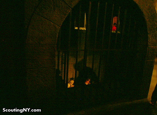
What I had no idea of at the time was just how thoroughly planned everything was. For example, as you’re walking through the Pirates of the Caribbean line, you’ll come across a barred cell:
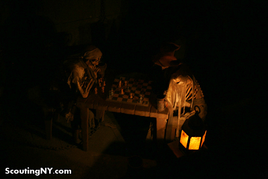
Look down and you’ll see a pair of skeletal prisoners who apparently died in the middle of a game of chess. A pretty great image in itself…
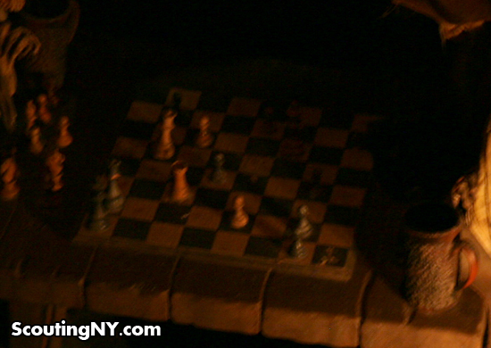
…but what makes it extra special is that the chess pieces have been purposefully arranged into a stalemate. In other words, the prisoners died trying to figure out a hopeless game of chess.
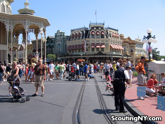
Like a Stanley Kubrick movie (yes, I’m comparing Disney World to Stanley Kubrick), there’s a philosophy governing every inch of visual space at Disney World. And while you may not consciously realize that, say, the four corner buildings on Main Street are meant to represent four different architectural styles found east of the Mississippi, I’ve always felt that deep down, you’re mind is very aware that something more is going on than random cutesy design.
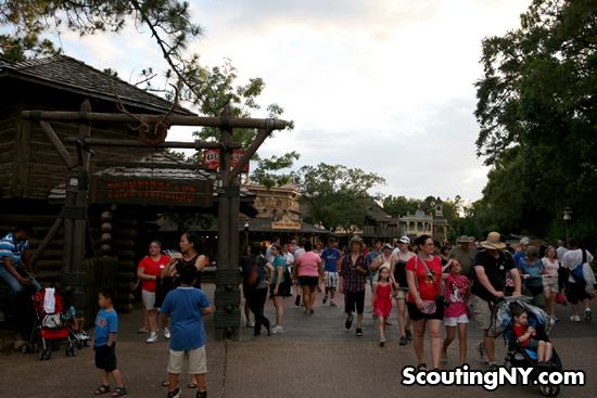
The arrangement of the various Lands is similarly ordered. As you move from Liberty Square to Frontierland, you’re thematically moving across America from east to west. When you start out, you’ll find yourself amongst New England colonial-style buildings…
As you move “west,” you’ll find that the Haunted Mansion was given a Dutch Gothic Rival style based on estates found in Pennsylvania and the Hudson Valley…
And as you enter Frontierland, note that you’re passing the entrance to the Riverboat ride entrance – in other words, you’re going over the Mississippi into the west.
Strangely though, on that first visit to Disney World, I remember feeling pretty strongly that one part of Magic Kingdom didn’t fit in with the rest. So as we were walking around yesterday, I made a conscious effort to see if I could figure out what was wrong with Tomorrowland.
When I was a kid, Tomorrowland was why I dreamed of going to Disney World.
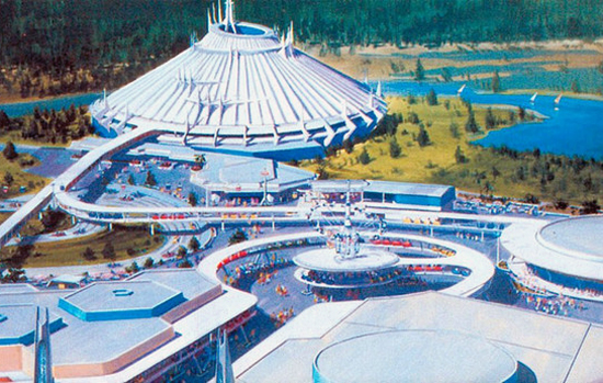
While other kids were into knights, cowboys, and pirates, I was always fascinated by future stuff. To paraphrase the captain of the Millennium Falcon, ancient weapons are no substitute for a good blaster at your side.

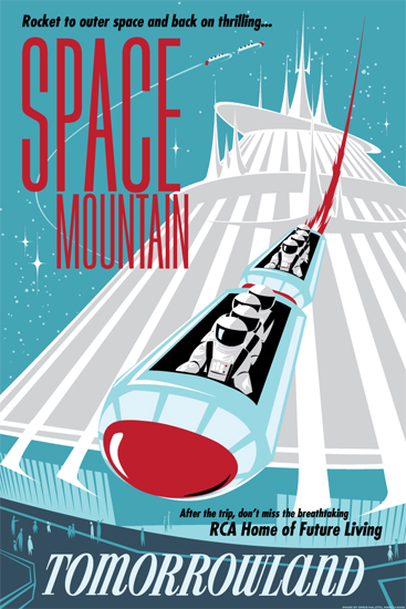
I remember being fascinated by the pictures I saw of Tomorrowland: lots of curving buildings, retro pastels, rockets, everything smooth and minimalist, yet totally futuristic:

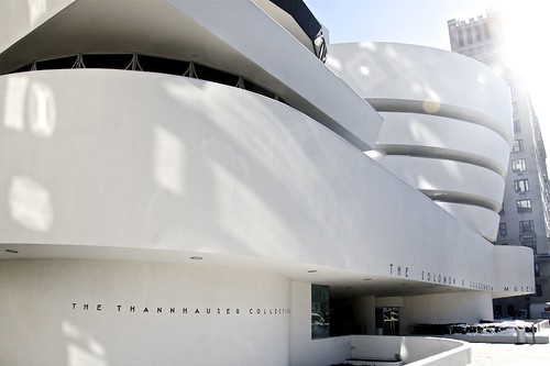
In fact, looking at these old pictures, you could basically drop the Guggenheim into the middle of it all and it’d fit right in.
And Space Mountain…Was there anything cooler than Space Mountain?
What was inside?? What exactly was a “space mountain”?? When I finally went to Disney World for the first time, Tomorrowland was what I was most excited for.

And like I say, something immediately felt wrong.
What was with all the stainless steel and jagged edges? What was all that random crap mounted to everything? Why did it all feel so generic? Where did Tomorrowland go??
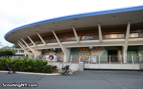
Apparently, Tomorrowland went through a major redesign in 1994, as the old look was considered tired. If you look hard enough, you can find areas that are basically unchanged, like this bit of the People Mover track swinging around the Carousel of Progress. Minimalist and retro-futuristic, it follows a consistent and imaginative style and design.
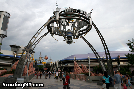
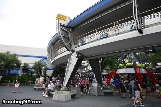
Unfortunately, the redesign, intended to give it a Buck Rogers/Flash Gordon makeover, left most of it looking like this:
It’s like they went out of their way to come up with the complete antithesis to the original design. Instead of graceful curves, soothing colors, and futurism by way 1950’s minimalism, we’re given harsh stainless steel, jagged edges, random tubes and pipes, and what has to be the most generic “future” world you could imagine.
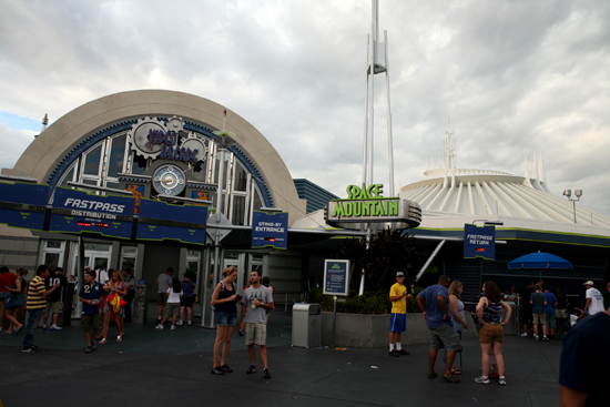
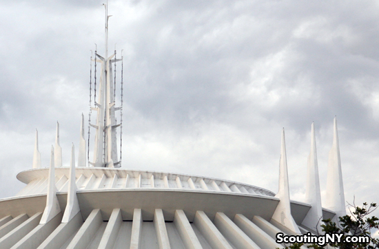
The wonderful Space Mountain is still standing in all its glory…
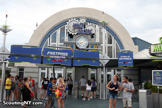
But its spiraling peak is almost dwarfed by the incongruous entrance they’ve added.
Again, gone is that 1950’s futurism aesthetic of simple shapes and basic colors; in its place, we’ve got…
Cogs? Really? Could there be anything more out of place in Tomorrowland? Instead of representing the future that might be someday, we’re left with the future that never was.
Ultimately, my biggest problem is that the styles never mesh. You can have curves or you can have jagged, but when you put the two together (or worse, one on top of the other), it feels…generic. Poorly planned. And nothing at Disney World should feel generic OR poorly planned.
Also, for some reason, a bunch of random gizmos have been added to the stops of buildings, like this…huh. I’m not sure exactly what it is, but it sure looks as “space-gizmo”-generic as possible.
Compare it to the “gizmos” atop Space Mountain and you’ll find they’re completely original. They’re mysterious. You wonder what their purpose might be. Your imagination begins firing…
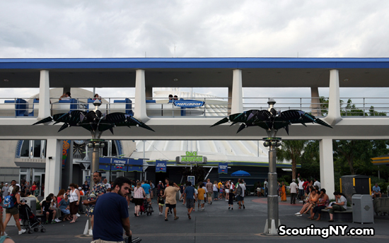
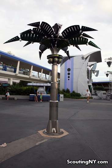
Another stark contrast: compare the smooth, mannered contours of the People Mover and Space Mountain to the newly added stainless-steel palm trees in front.
Razor-sharp and cold, it’s the polar opposite of its surroundings.
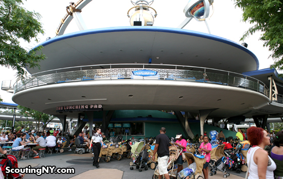
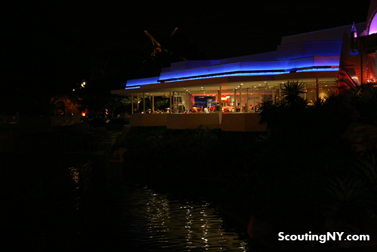
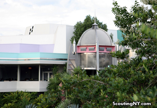
One of my favorite views in the park is of this Tomorrowland eatery, as seen from a nearby bridge. It looks so cool lit up at night…
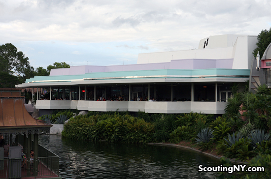
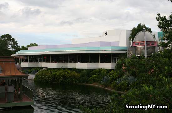
And even during the day, still carries that old Tomorrowland look.
Of course, it’s a little tired feeling, so why not pep it up with a jaunty rocket ship in the bushes.
It’s not that I’m against changes to Tomorrowland. In fact, adding a rocket ship beside a cafe, as if some intergalactic guests have stopped in for a bite, is a fantastic idea. But you have to match the style of the world around you, and again, this is simply the opposite, with its silly, child-like design.
You’ll hear a lot of hardcore fans claim that Disney has lost its touch, that everything today is about cost-cutting and rushing visitors through, and that the Imagineer’s trademark planning, attention to detail, and creativity has become a thing of the past.
But there’s at least one modern ride (2006) that suggests the ol’ Imagineers are at the top of their game, and that Tomorrowland might just be a fluke.
If you’ve never been on Expedition Everest, the concept of the ride is that you’re taking a train ride up to the summit of a peak near Everest…but beware! The legendary Yeti has been seen in the area recently…
Part of the reason the ride is so great is the creativity of the line, designed as as though you’re passing through a Tibetan village called Serka Zong to board your train.
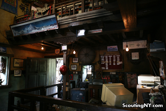
First, you find yourself in “Himalayan Escapes,” the office of the company leading the expedition up the mountain (pictured above), and the details are spot-on perfect. I love the old computer and ancient TV/radio…
In the background, though they’re too far to make out, a bulletin board above an old laserjet printer is littered with postcards and letters from past tours groups, photographs from expeditions, and an article on a possible Yeti capture.
On the neighboring wall, a map of Everest’s climbing routes, along with a framed “Thank You” letter from a past expedition goer, Col. Edward Blanchard, who asks whether the company’s guides “ever found the tents? Never seen a wind like that in my life.”
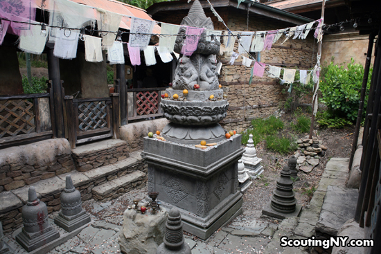
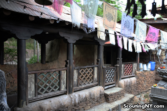
Look extra close, and you’ll discover the full story of how a British explorer teamed up with a native Anandapuri to start the business…but no time for that now. As you leave the expedition office, you find yourself in a back yard of the Tibetan village, lined with prayer flags centered around religious statuary…
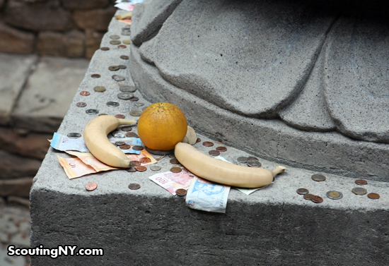
…with offerings left for safe passage:
Continue on down this corridor…
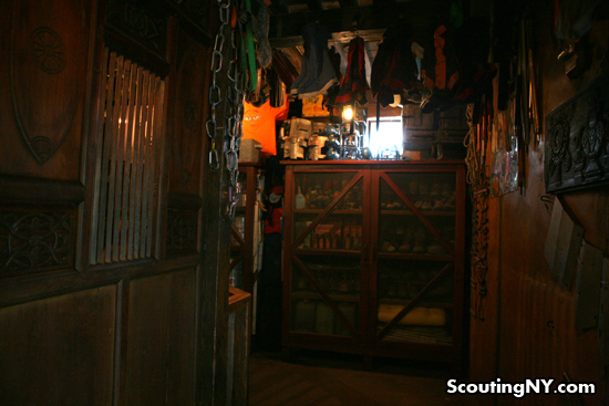
…and you come to “Tashi’s Trek & Tongba Shop” (Tongba is a millet-based alcoholic beverage popular in Nepal).
Step inside Tashi’s shop…
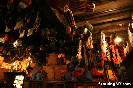
…and you’ll find the ceiling completely covered in climbing gear for sale, from ropes and sleeping bags to packs and pick-axes. So cool…
In addition to the modern equipment, there’s also a sense of the traditional, like the tin cups and plates being sold behind the counter:
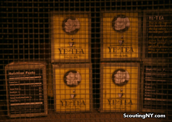
A bunch of canned goods native to the region are for sale…
…Along with a few, er, original items…
Finally, the line takes you through the village’s Yeti Museum.
If you take a moment at the entrance, you’ll see a wall with a photograph of one Professor Pema Dorje, founder of the Yeti Museum. Diplomas reveal his Masters in Anthropology and a Doctorate in Conservation Studies; a museum operating license is mounted beside them.
But most important is an old framed newspaper clipping announcing the opening of the museum, along with Dorje’s claims that the Yeti is real – and dangerous. “The weight of the evidence gathered here, insists Prof. Dorje, establishes conclusive proof of the existence of the elusive creature known throughout the world as the ‘Abominable Snowman.'”
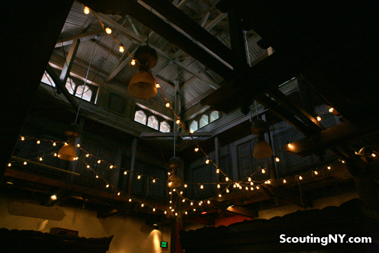
The museum has a large open roof lined with string lights…
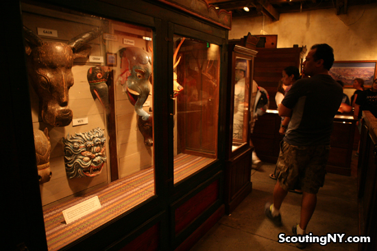
…and is filled with a wonderful assortment of real and fictional artifacts relating to the Yeti.
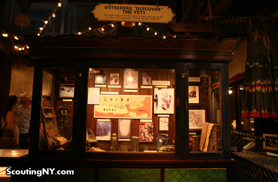
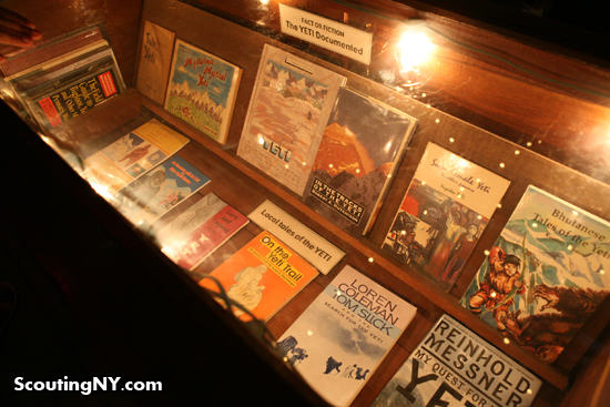
Display cases are filled with books and maps…
…nearly all of which are real:
Authentic magazines:
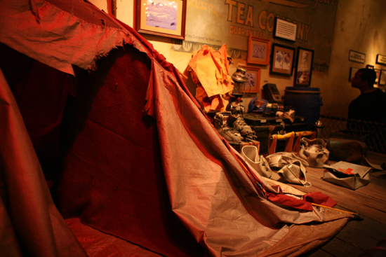
But things take a darker turn as you come across an exhibit entitled “The Mystery of the Lost Expedition.”
Here, you find the tattered remnants from a group of hikers who went into the mountains…and never returned (of course, it would make sense if the group was led by Himalayan Adventures and outfitted by Tashi). The tent is in ripped to shreds, equipment is crushed…
Finally, as you’re about to board the ride, you pass by one final remnant from the lost expedition: a cast of a strange footprint found during their trek…
And then, it’s on to your ascent.
Opened in 2006, Expedition: Everest is Disney at its most imaginative and immersive; Tomorrowland is Disney at its laziest. It’s doubtful, but I hope the latter will someday rejoin the former to become the experience that makes Disney World so special.
-SCOUT
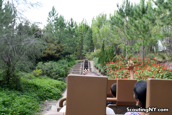
PS – For those who have never been on the actual Exedition Everest ride, your train tour begins in the lowlands…
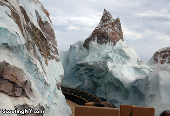
As you ascend, the foliage soon disappears, replaced by snow-covered peaks…
Finally, your creaky train car arrives at the summit…
…where you notice the train tracks have been completely ripped up in front of you.
And then your car starts rolling backwards…
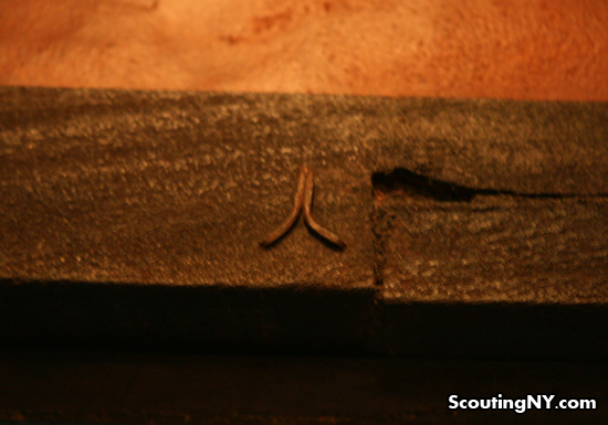
PPS – I noticed this bit above several doorways leading to the ride: a good luck symbol perhaps?
PPPS – Be sure to check out The Horizons Tribute, a wonderful collection of vintage Tomorrowland pictures here.
PPPPS – More roadtrip updates coming soon!

























Have you read about all the hidden things at Disney Land? I’m not sure if this is the park you went to, but either way there are a lot of similar lists out there for all the parks.
http://www.freerepublic.com/focus/f-news/1528718/posts
That apartment you mentioned above pirates? It’s fully furnished and people can actually stay there. There’s more than one such place like that but iirc that particular one is the Disney Dream Suite. It’s also very expensive.
The Disney Dream Suite above Pirates is in Disneyland in California, not Disney World. Disney World’s Dream Suite is inside Cinderella Castle, near the top.
The reason Tomorrowland went through an upgrade in the mid 90’s was that it just wasn’t looking very Tomorrowish anymore. It looked old and dated, as the 90’s vision of the future was very different. So Imagineers came up with a pretty terrific solution to the problem of “Who do you make things look like Tomorrow when Tomorrow keeps becoming today?” What you do is make the “Tomorrow that Never Was”. Far from being generic, the design is based on the Buck Rogers style of the 50’s and 60’s, and Tomorrowland changed from being a bunch of attractions housed in the same area to a “Community”. If you look closely at the signage you will discover that you are in a downtown district of some future city…each attraction is now housed in a building that is part of this downtown. Stitch Great Escape is at the Galactic Federation Teleportation Center. Walt Disney’s Carousel of Progress is a museum. There are posters advertising acts coming, a telephone booth from the future, tons of details to put you in a very specific place. The cogs at Space Mountain are there because it is an “Old-Fashioned Video Arcade””, it’s supposed to look that way! While you may not like the aesthetic, it still is a purposefully designed one and not a bunch of haphazard parts thrown together.
As I think I was clear on, my problem is mainly with the idea of overlapping an old style of futurism with a new style that is completely antithetical. You can have curves or you can have jagged, but when you have both, it immediately starts feelings poorly planned, as this does.
The old aesthetic was also The Tomorrow That Never Was, the future as envisioned from the 1950’s. I had a line in about Buck Rogers which I now see I removed, but man does none of this remind me of old Flash Gordon serials. In terms of layering, it just feels shallow – sure, there are cutely-named stores and a few posters, but none of it has the layer-upon-layer of storytelling of pretty much everywhere else.
And yes, the problem with futurism is you can never be right, and quickly can look outdated. But I always am impressed by those who continue to envision a future that never will be, vs. a historical future that never was. I really think our generation has stopped imagining the future beyond the next iPhone upgrade.
The real problem is that the future stopped happening.
The Apollo-era rocket ships and similar details just looked horribly dated, but what did we have to replace it with? Space shuttles, I guess, but by the mid-90’s that would have screamed “present” not “future”. I guess one core issue with tomorrowland was its focus on space and space travel, which really stopped being the future a long time ago.
As far as design aesthetics, you’re right. The sleek, retro curves were elegant and better than the generic gadget (cogs) version that they layered on top of it. But in the 90’s that’s what the future aesthetic WAS. They would have been better off waiting another decade for the refit. By then Apple’s sleek, minimalist design would have informed the work and they may have come up with a terrific blend of retro and contemporary-future. They also would have had a more clear focus to pivot away from space travel and towards computers and mobile / globalization / urbanization / biotechnology, or whatever else.
It’s always difficult to predict the future, and even worse, it remains a moving target. Worse, they started with space, which was, in retrospect, not the right call, so of course it’s going to look particularly dated. It’s the same reason that Back to the Future II looks so dated but the original stands up so well.
The other Disney areas all use the past as a starting point, or at worst a shared cultural phenomenon that comes out of the past. They are on more solid footing. But even they have little areas, such as the computer in the expedition ride line (in the “office”). Aging isn’t easy for anyone!
You’re 100% right about everything but the computer – like the TV, it was intentionally subpar to reflect the ragtag style.
But yes, all futurism is a doomed to look outdated in about ten years from inception; in fact, I’m surprised no one has formulated a law about how quickly this will happen.
Again, to be clear, I have no problem with Tomorrowland being a continually changing enterprise. But slapping one style on top of the other just feels so shoddy to me.
My in-laws live in Orlando and my otherwise retired mother-in-law works at one of the Downtown Disney stores to keep busy. So, we’re down there often with the kids and we get in with complimentary passes.
You’re right about both the impressiveness of the level of detail put into the parks and the disappointment of Tomorrowland.
Great pictures!
If you ever return to Orlando, I highly recommend taking the Backstage Magic Tour. It’s pricy at around $230, but it lasts about 7 hours (with lunch included), and it takes you behind the scenes of some of the parks and facilities, and they give you a lot of tidbits about how the parks were designed, and the research behind it. You even get to walk through the tunnels under the park. The only caveat (besides the price), is that they don’t let you take pictures of the backstage areas. It’s a really cool experience though, and seems like it might be up your alley.
Tomorrowland, and the ’64 World’s Fair, were Jetson-era visions, and visions of the future changed right after ’64. Tomorrowland quickly became Yesterdayland. The ’90s update seems to have reflected the Retro-fantasy sci-fi that Star Wars got started. And the key here is fantasy, not vision. Walt Disney would not approve. If he had been around it would have looked more Jony Ive than “Transformers.”
I’m glad you mentioned the ’64 Worlds Fair and the similar vision. Both were built with heavy Googie aesthetics and thus Tomorrowland had a dated look the day it opened since Googie was already falling out of style.
Hey Scout, check out ” It’s a Small World” while your there. It was said at the time Disney World opened that ride was a reconstruction of Disney’s Pavilion from the NYWF.
Enjoy your travels and keep us posted.
Hey Scout, check out ” It’s a Small World” while your there.
And then in about ten years he’ll finally be able to get that ghastly theme song out of his head. If he’s lucky.
Loved the Disney’s comparisons. Now can we hear about the trip to
Key West sice that is my area of expertise….
Hey Scout,
There’s a website called Yesterland all about Disneyland and Disney World of long ago, it is really interesting – http://www.yesterland.com/
I can’t remember when I was at Disney World. It was back when I was married. The thing I do remember of Tommorrowland was the ride inside Space Mountain, everything else was in Tommorowland was to pharaphrase Scout, Six Flagish. The rest of the park wasn’t all that memorable but the character dinner was the memory I’ll have until I croak, and that’s the deal with travel, it’s the memories you take with you, and you can’t have any memories if you don’t open your mind, ears and eyes to experience what’s around you.
Sharing your love to heavily thought details, in the closeup of the tibetan sanctuary, you can find some euros (I think) some fruits, and…. a $2 argentinean peso bill!
I wonder how it came to that place.
That bill it’s around 0.5 u$d so it won’t buy such a safe voyage to that traveler.
Look closely at you tomorrowland pics. Notice the tiny patches of lime green and blue. When did Toy Story come out? Those are damn Buzz Lightyear colors! Hopefully the next time around, they’ll talk to Syd Mead.
Good to see you on the road again. Have fun Nick. I will be hanging on every post as it comes in.
An amazing post Nick, as only you can present. Thoroughly enjoyable, gave some food for thought (as you usually do) and it sure fired the imagination of the child within me! thanks.
@Marcia
Yesterland is awesome, but pretty Disneyland-heavy; a great, similar site exclusive about Disney World is Walt Dated World, which can be found at http://waltdatedworld.bravepages.com/
I had a similar reaction to yours when I looked at your pictures of Tomorrowland, Scout. It looks like they replaced 50s/60s futurism with 1980 futurism. It is sort of Buck Rogers/Flash Gordon as you say, but the new People Mover look mainly says to me “Happy Meal Toy:” plastic made to look like metal, with lots of extraneous subsectioned shapes.
I can’t remember if this is what futurism was like in 1994. It seems like they probably need another update. My guess is that it’s come back around to curves, perhaps with a touch more minimalism. Apple comes to my mind.
Oops, I see Erik already made a similar observation with more detail and insight.
I love Disneyworld! It’s so nice to visit it again through your photos. My husband has a good Pirates of the C. story: when he went on the “boat ride” the mechanics got stuck and they sat there for nearly an hour hearing a mechanical parrot call out to his pirate friend – he nearly went crazy.
Here’s a thought about Tomorrowland. Many of the earlier comments argue over details of how futurism ought to be represented stylistically, yet no one has mentioned the real 500-lb. gorilla: that nowadays our dreams have darkened – our societal dialogue has become fundamentally clouded by pessimism and fear, so that ANY visions of a “bright future” – no matter WHAT they look like – are doomed to appear hopelessly out of step … because we simply don’t think that way anymore! (“Homeland Security”, anyone?)
I agree with many of the comments here. When I was a kid, Tomorrowland was the main reason I wanted to go to Disneyland. The mid-sixties Tomorrowland seemed to represent the best of Disney’s design and optimism and it was just plain fun. The entire park was, in a way, a vision of how businesses could run in the future. For me, it was a place I looked to for inspiration. Much of the world has caught up to and passed the park and for me it really is now just an amusement park, with lots of nostalgia attached.
ewww Tommorowland looks like crapola. I visited it in 1991 back when it still sported the minimalist look.
I’ve learn some good stuff here. Definitely price bookmarking for revisiting. I wonder how a lot attempt you put to make one of these magnificent informative website.
There’s a reason why Imagineer Marc Davis designed those jailed pirates to be stuck in a game of stalemate: It was his idea of a joke. They’re dead pirates. They’re Stale Mates. Get it?!
im 15 and this is what i have grown up with and i had never see the “old” tomorrowland and i can see where you are coming from. when i started to get older and more of a disney fanatic i looked at the paris version of tomorrowland or “discoveryland” and i found the two to be some what similar besides the fact that paris is based of jules verne. but the fun thing is, is that with the new movie coming out (tomorrowland) alot of people have been speculating that tomorrowland will be rebranded and remodeled! which i hope im not the only one hype for this because if it is going to be remodeled after this movie the place will look great and will really go back to what you said with the curved buildings and such.