The amount of detail to be found in NYC is absolutely mind-boggling, to the point where there are ornamentation and decorative flourishes that are simply invisible to anyone but the birds.
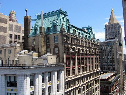
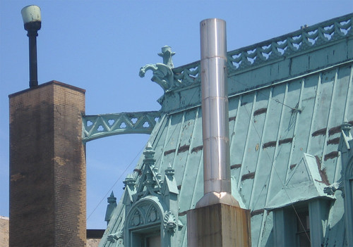
A few years ago, I was working on a job that had a camera position on a roof near Madison Square Park. I got to spend a few beautiful summer days about 20 stories up, which afforded a fantastic view of this building on West 26th Street between Broadway & 5th.
This building is covered in intricate detail, but what is really incredible is that most of it is way, way too far up for anyone on the street to see. So who was all this designed for? Even from my position, it’s still hard to make anything out. But when you get a little closer…
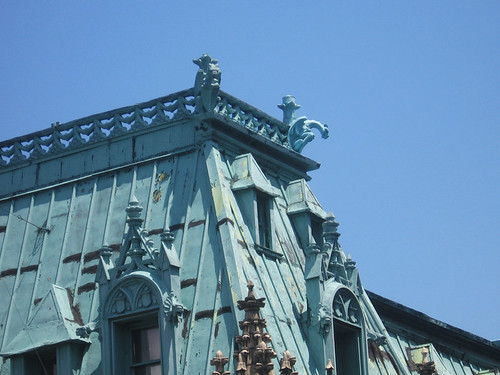
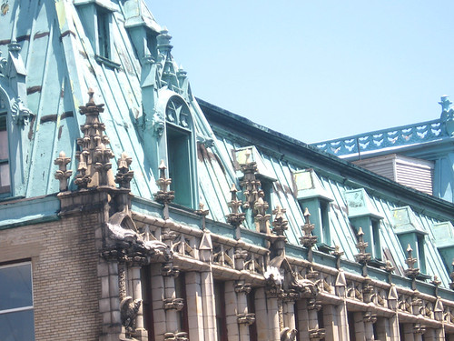
If you look a little further down, you can see flourishes of design everywhere…
…including these guys hanging out on a ledge.
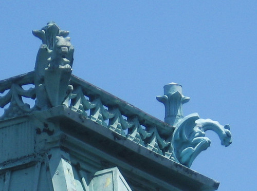
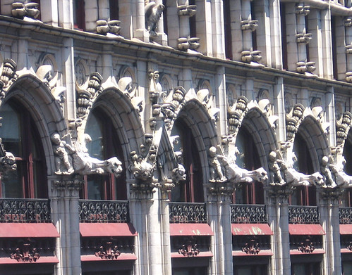
Move a little further down still and you get this great row of gargoyles (or are they grotesques? Can’t tell if they are hiding drain pipes)…
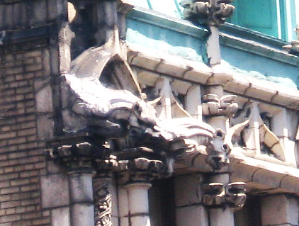
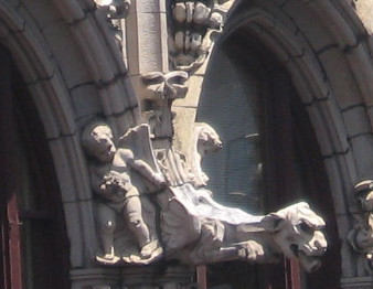
Up close: a cherubic baby beside a monstrous gargoyle, complete with curled tongue…and there is simply no way you could see this from the ground. Brilliant.
There was a time when the standard for architecture was insanely high, far beyond the modern expectation of simply maximizing square footage. It blows my mind when I visit tenements that were once intended for the poorest of society and yet were still built with a few interesting decorations in the brick work. Meanwhile, modern standards, courtesy of The Brownstoner:


I’m not trying to depress everyone on a Friday, really! I’m just trying to reinforce how amazing it is not only that such a building still exists today, but that there was once a time when such a vastly different standard was held.
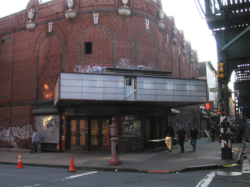
Those days are sadly gone forever, which makes it all the more important to preserve what still remains. I happened to drive by this old boarded-up movie theater in Williamsburg on Rodney and Broadway today…
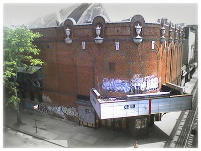
…except it’s no longer there. It was recently demolished, making way for what I expect will be more of the same old shit. It’s yet another reason to pay a little closer attention to the city – there’s a lot to see, but what exists today could very well be gone tomorrow forever.
I want to thank everyone for a fantastic week. We had a ton of write-ups in various blogs, including Curbed and the New York Times, and hopefully found a few new readers! You can always subscribe to the RSS feed above for easy updates. And there’s a lot more to come in the weeks ahead! Have a good weekend…
-SCOUT


I am a new reader and love your eye for building design and potential. You pick out details I would never notice walking by. It makes we want to take a little more time walking down the street… Keep up the great posts!
well, you found me! and i have to say that this is exactly the kind of content i’ve been wanting to read about nyc. i couldn’t agree more.
just today i was thinking “what happened to topping builings with a spire (or any such pointy top. chrysler, woolworth, etc)?” everything that goes up in nyc is a rectangle. yet whenever nyc’s greatest buildings are discussed, they’re hardly ever anything boxy. it’s usually a building with a few setbacks, carefully crafted ornament, and a spire. not that i want to see a bunch of chrysler/empire knock-offs, but i’d like to see something new that isn’t so damn flat-topped.
anyway, i’ll definitely be checking this site for any and all updates.
I am happy to have stumbled upon your blog. Although a modernist at heart, I share your admiration for buildings that show glimpses of a past where craft, skill and longevity in architecture existed. I cringe at the crappy, wasteful construction we allow to exist. (well, for its short lifetime anyway) The fact that these well crafted beautiful buildings still stand are testament the methods behind them. That is probably why I love older cities much more than the newer ones. NY is one of my favorites. I look forward to what you find 🙂 happy scouting!
Those gargoyles really made me smile. Thanks for brightening my day!
If you enjoy amazing architecture and detail, visit Montreal, Canada – the old section (Rue St Denis, Square St Louis, etc). NYC hasn’t been the same to me every since.
Just found your website via NY Mag. The photos are stunning. I stayed at the Marriott at the World Financial Center a couple of weeks ago. From my room on the 28th floor, I was able to see incredible detail of a neighboring building (don’t know what it was) including gargoyles and intricate work on the copper roof. It really is fascinating stuff.
Really amazing photos, and a very nice point of view on buildings that otherwise would not be noticed in daily life.
While I like modern buildings, your comments about the newer buildings are good points. It is very sad that developers these days cheap out on building materials, while the users of the buildings do not care about the quality of the building either. Education perhaps? Or is it because of the ever rising prices of everything and distribution of wealth that we can no longer afford affectionate details anymore? Cast iron ornaments and carved stones were actually not hard to do, but modern buildings effectively stripped away the jobs of such craftsmen… and lost. Some of the new buildings tried to have ornaments, but they were made of painted foam (I’m not kidding about this) placed in the most awkward proportions.
However, if the building designs were not simplified as today, we would have never been able to cope with the demand of our rising population. I just wish architects these days not just know how to deal with building codes, but also some sense of aesthetic proportions.
a footnote: The movie theatre in Williamsburg at Rodney and Broadway was used for an exterior (we created a period marquee) in Woody Allen’s Bullets Over Broadway…(A bunch of gangsters get gunned down in front of it)