Scouting NY Has A New Website
Quick site note –
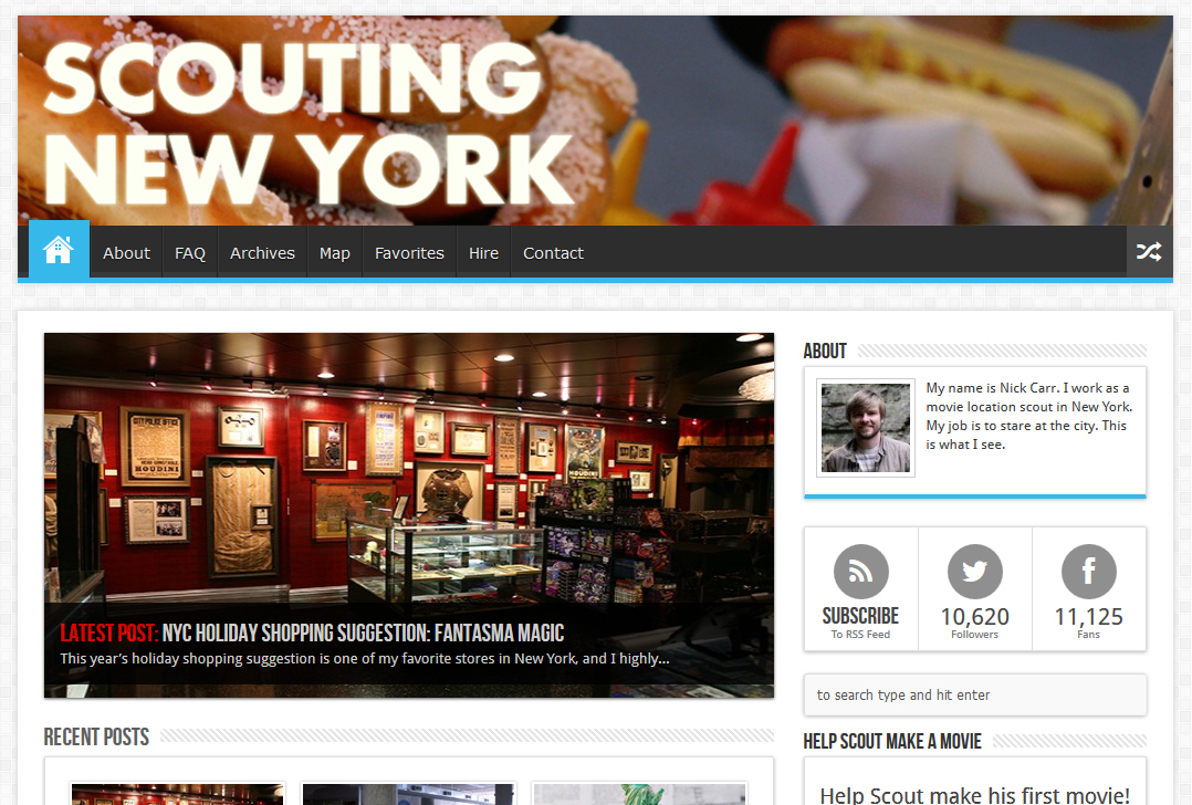
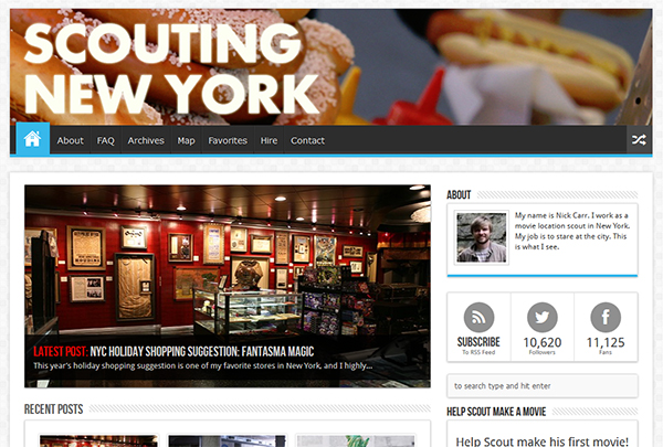
After five years of having the worst organized website on the Internet, Scouting NY finally has a new design!
I loved the old site, and resisted making the change for the longest time (I hate when websites I like completely change their layout). But I had to do it – I work really, really hard at these posts, and it was killing me to see them disappear into the most primitive archive system imaginable.
The new homepage finally allows me to bring all of my work to the front of the site, randomly swapping articles at each visit. If you’re new to Scouting NY, check it out – you’ll probably see something you’ve missed! Meanwhile, the individual posts are still the same, except now there’s more room for larger pictures. Seems like a win-win situation to me!
I’m still loading older posts into the system and fiddling with the look, so please excuse any weirdness you might encounter over the next few weeks.
And thank you as always for reading!
-SCOUT


Great look! But why blurry font on blurry background in the header?
Very nice! I’m looking forward to your 2014 posts!
Nice redesign. One suggestion: You should switch to post-name permalinks. They’re better than the nondescript default page IDs. And it won’t affect older posts, they will still go to the proper page.
Really? All this time, I thought I was trapped into using the original WP permalinks because if I changed it, it’d alter all the past links. Will make the change for the next post, thanks!
Well to be clear—it will change the old links, but the ID links always work (they’ll bounce to the new URL). So any sites pointing here will be fine.
And WP will do a 301 redirect from the ID-based links to the “pretty” permalinks so any links indexed in search engines will be updated eventually (for Google, check your Webmaster Console to see the status).
Wow – congrats on the new site! Looks good.
-Dan