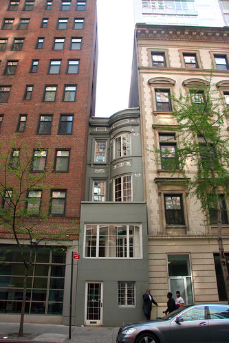
I was walking down West 58th Street when I saw it: exactly half a brownstone (12.5 feet), gloriously smooshed between two much larger apartment buildings:
I was immediately reminded of one of my favorite buildings in midtown, the very similar 19 West 46th Street, also measuring 12.5 feet.
A number of readers have written me that the city used to sell lots in 25′ increments, and that developers would sometimes build two “twin” houses, each measuring 12.5′, on a single property. Perhaps one of the buildings at 420 West 58th St was razed at some point to make room for the surrounding apartments, leaving behind its anorexic twin.
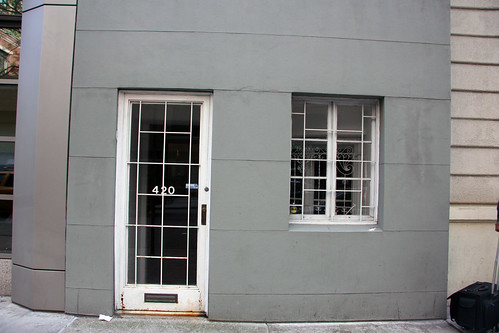
If you’ve missed this great house in your travels, it’s understandable – for some bizarre reason, the owners have boxed in the bottom two floors in quite possibly the ugliest gray encasement imaginable.
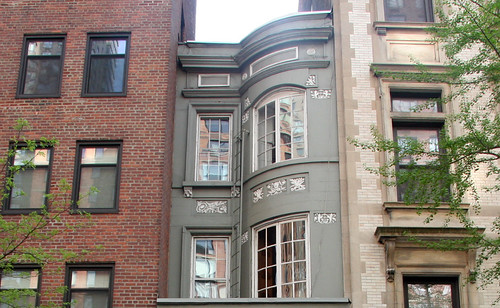
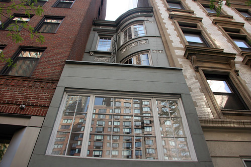
A real tragedy when you look at the upper two floors and realize what is being hidden away.
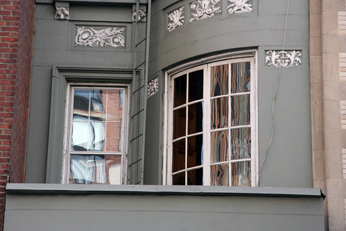
Though I love the simplicity of the brownstone on West 46th Street, this has it beat in terms of detail – I love the rounded window and the ornamentation.
The third floor. Note the fire escape ladder:
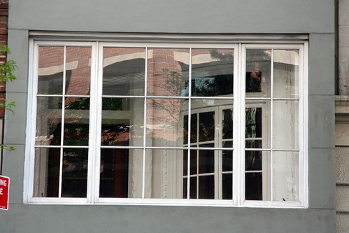
Looking through the second floor windows, you can see the building is still in tact on the other side, forming a sort-of enclosed porch. Why they would choose to cover it up without even expanding the property makes no sense to me. Any guesses?
The bottom floor:
According to CityData.com, the house was built in 1910 and has 2,180 square feet. It doesn’t seem like it’s connected to either of the adjacent apartments, as the windows don’t line up – but this could be fixed with a small set of stairs.
Incredibly, the building doesn’t even appear on Google Maps’ Manhattan property outline map, a first in my experience.
Besides that ultra skinny building the West Village, anyone know of other “orphan” buildings in New York?
-SCOUT






Ever feel like one of those buildings? A small but sophisticated little jewel, smooshed to the point of asphyxiation by big ugly monsters smothering you on all sides, forced to wear a bland face that covers up your stunning, glamorous ornamentation? Dismayed that those hordes of mindless passers-by know nothing of the beauty that quietly beckons within? Story of my life.
Perhaps they boxed it in to preserve the street level facade from degradation?
I walk past that building everyday going to/from work. It has always intrigued me for exactly the reasons you point out. This stretch of 58th Street is a really eclectic set of buildings,e specially with the new ugly Related development at the western end.
I wonder if the Edna St Vincent Millay house is the ultra-skinny one you are referring to in the west village, right?
There is a very skinny building at St. Marks Place, just east of 2nd Avenue. I believe its number 40 or 42. I could never figure out if it is part of the building left of it, or a completely seperate structure. It does have its own entrance.
Check out 292 Lexington Avenue (just south of 37th St.). It may or may not be connected to the building to its right, which is the corner building. Many building similarities, but that corner structure has its own entrance and separate building number. I see it almost every day on my walk to work and it bugs me every time that I just can’t figure it out. The Google property map does not help. It’s probably the same building, but it just looks like its own thing.
It reminds me of this skinny house from my old ‘hood: http://www.nyc-architecture.com/GV/GV043NarrowestHouse.htm
Great find Scout.
420 bro
I love this little house! So unexpected. For a while, I would only notice it when I walked on the opposite side of the street. I used to walk by it every day when I lived by the hospital and always tried to get a glimpse of the interior. Never did though. I did, however, actually see someone go into the house once.
Reminds me of this house in Old Town Alexandria, VA. Just 7 feet wide. http://www.washingtonpost.com/wp-dyn/articles/A31199-2005Jan23.html
I moved into the neighborhood recently and walked by this gem of a house and thought to myself “Wow, Scouting New York should totally do a feature on it!” And low and behold, you’ve already covered it! It reminds me of rare olive-colored Wedgwood porcelain and it makes my day just to walk past it.
I suspect the facade was added to prevent street people from taking shelter in the recess the original design left. They could have just put a wrought-iron fence there instead and it would have been much more attractive.
Pingback: Where Did The Rest Of This Brownstone Go?? The Sliver Building On East 37th Street « Scouting NY
Pingback: Skinny Townhouses: Pet Architecture in NYC « TownhouseCenter.org
Pingback: Google Maps Manhattan | Home Beer Brew - Free Tips and Resources
For me, there’s something oddly attractive about the boxed-in facade. The marriage of ornate and minimal; a house within a house. I would love to live here.
Pingback: 5 of Manhattan’s Narrowest Buildings | Untapped Cities